NEAR


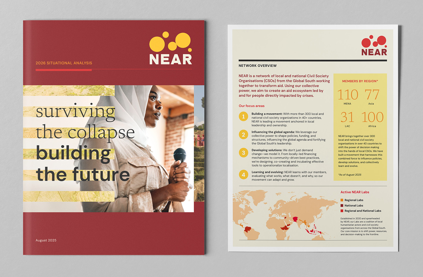
NEAR—the Network for Empowered Aid Response—is a global collective of more than 300 civil society organizations across the Global South, working to shift power away from traditional, Global North–led aid models and toward local actors who best understand their communities. For over a decade, NEAR has been building a more effective, equitable future for aid, and has become a powerful voice on the international stage. But their brand and communications didn’t reflect the influence they already had.

Working with Ochre, NEAR took the opportunity to clarify their role and step fully into it. Through a collaborative strategy process, we helped the network define a bold leadership position—one their partners already recognized, but NEAR hadn’t yet claimed for themselves.

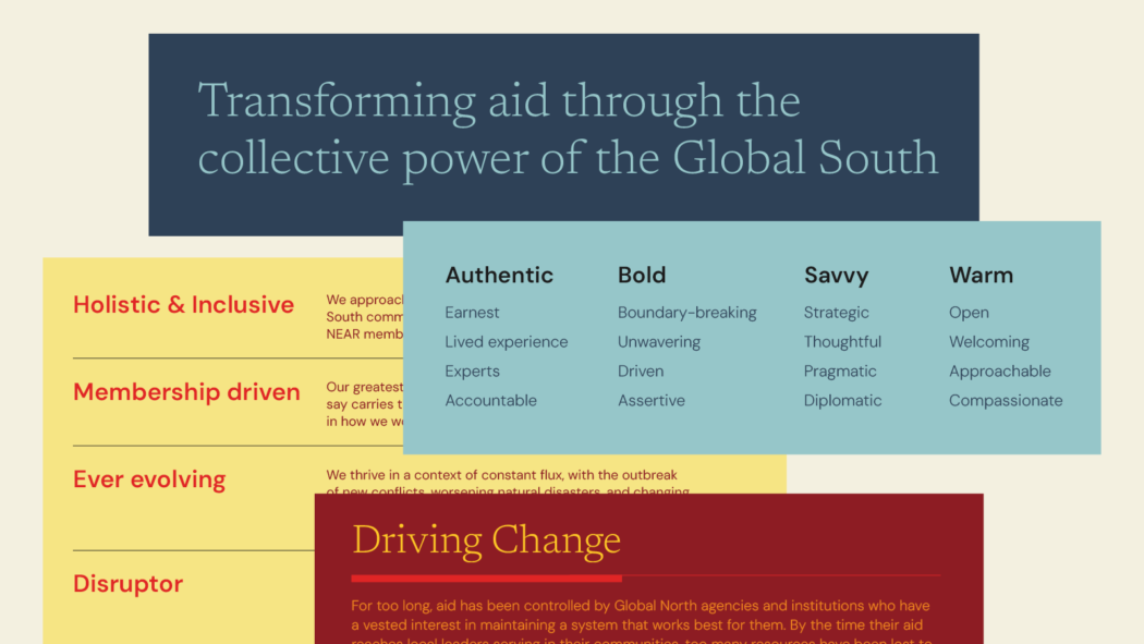
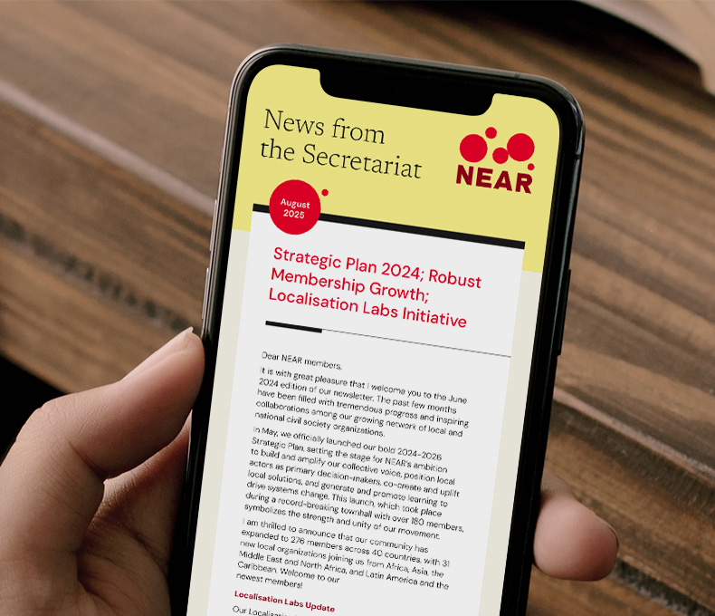
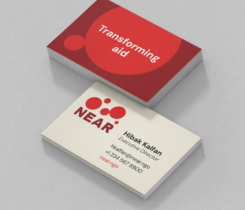
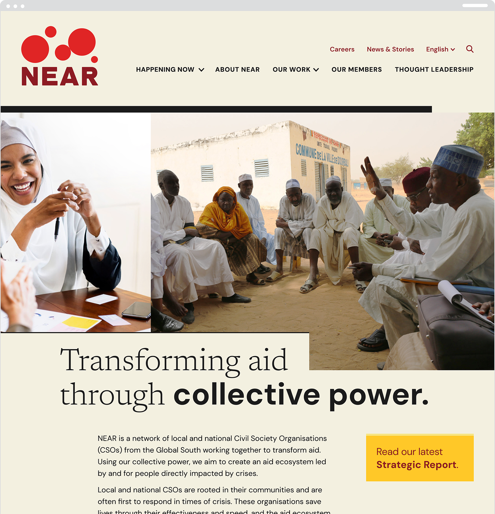
The result was a brand that positions NEAR as a savvy disruptor of the global aid system, combining credibility with conviction. A unified messaging framework sharpened their voice, and a modern visual identity brought their collective power to life. Today, NEAR has a clearer presence and a brand that finally matches the movement they’re building and their collective power.

Side-by-side comparison of NEAR's old and new logo
As NEAR approached its 10-year anniversary, the network wanted to retain recognizable elements of its logo while evolving toward something more modern, one that reflected their newly defined brand attributes: a bold, disruptive force grounded in connection.
NEAR’s challenge wasn’t impact—it was articulation of all the things they’re doing. Through a brand strategy shaped by internal reflection and external perspective, the network saw itself more clearly: as a credible, influential disruptor of the global aid system. That shift in self-perception became the foundation for everything that followed.
African woman speaking
Group of Maasai people sitting in circle
Collage of men in Africa
Two young women working together, one of whom is wearing a headscarf
The graphic system builds on the idea of disruption. Subjects break the frame, images abut or intertwine, and compositions resist containment. The variety of photographic treatments reflects a network that is many things at once and impossible to define by a single narrative.
Brochure cover and one pager
Hand holding a phone looking at a newsletter

Two stacks of business cards

A flexible suite of materials demonstrates how the system comes to life across reports, one-pagers, newsletters, and stationery, ensuring clarity and consistency at every touchpoint.
NEAR's website homepage
The new website brings it all together, showcasing the breadth and depth of the network, articulating their ground-breaking work with clarity and precision, and serving as a central resource hub for local actors around the world.