28Stone


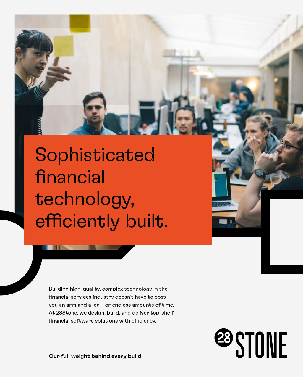
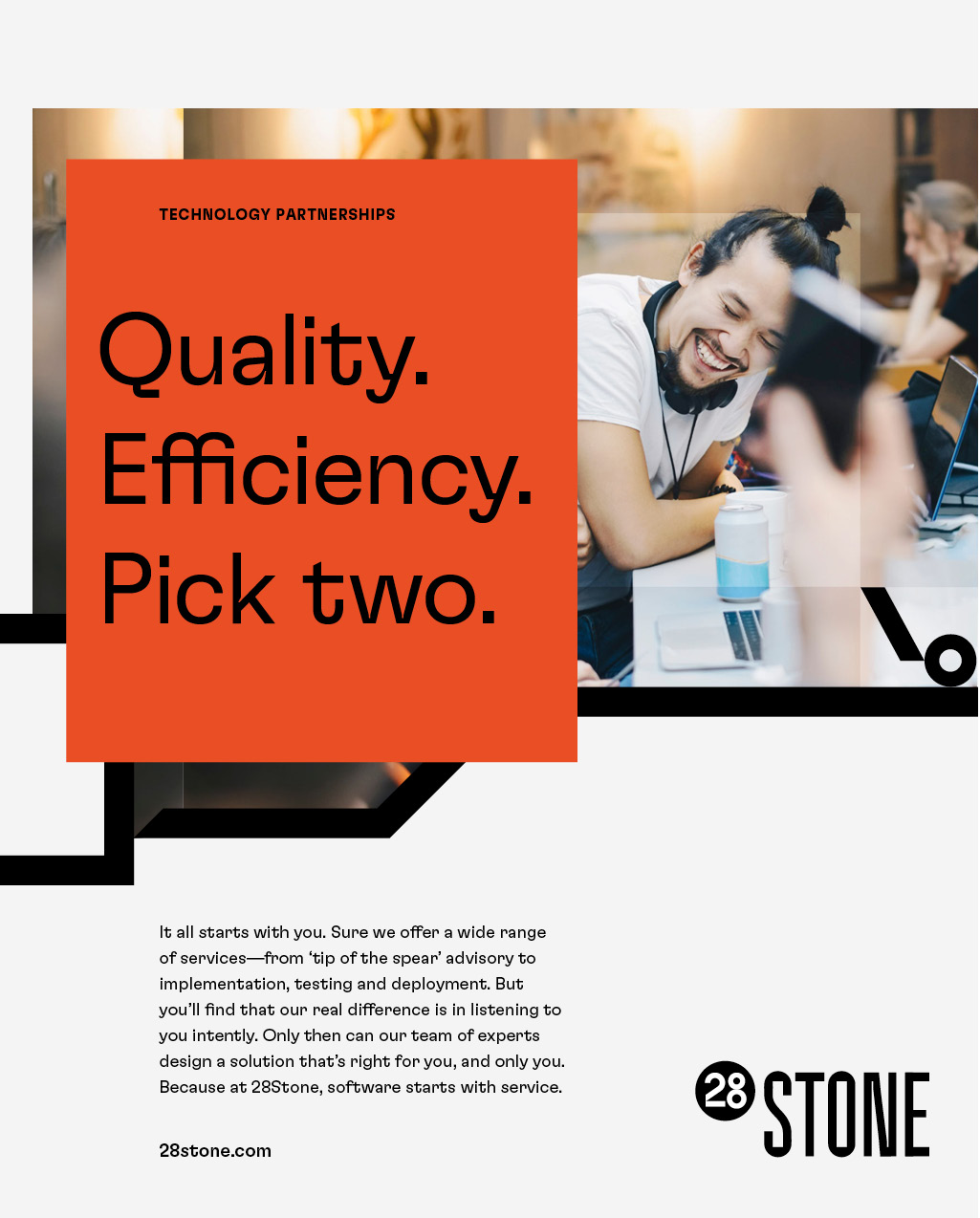
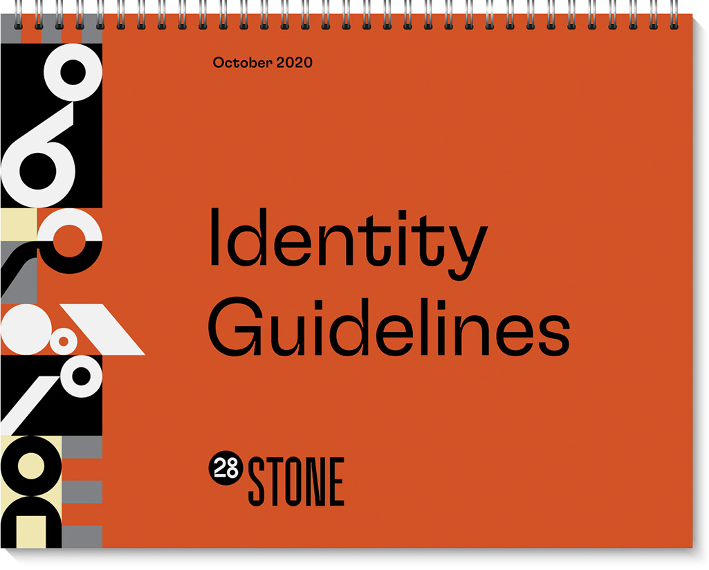
As a technology company focused on providing financial services of value, 28Stone needed an identity that felt as modern and approachable as they were. The solution was to define their core values and brand strategy and then build a visual identity that brought them to life. In addition to redefining the logotype, color palette, and typographic expression, we developed an ownable pattern that tied things together and added a sense of play and curiosity.
Created at Thinkso
28 stone logo on an orange background
28Stone draws its name from the unit of weight and since 28 stone would be pretty heavy, the logotype needed a certain heft. We also developed a secondary mark serves as a standalone identifier and is well-suited to social media applications. It was also a good opportunity to create a modular display face, based on the logotype explorations, for special uses.
Website layout with the headline "sophisticated financial technology, efficiently built."
LinkedIn mockup for the company
The website and LinkedIn pages incorporate a custom pattern that evolved from the logotype and display face designs. Much like a good approach to website design, the modular macrographics could easily be expanded and helped provide the approachability the company sought.
The tagline “Our full weight behind every build.” gives context for the name and core value on advertisements.
A set of brand guidelines helped define the company’s brand and messaging strategies, brand voice, and ensured the visual identity would be easy to implement and remain consistent across every brand expression.