MEMX


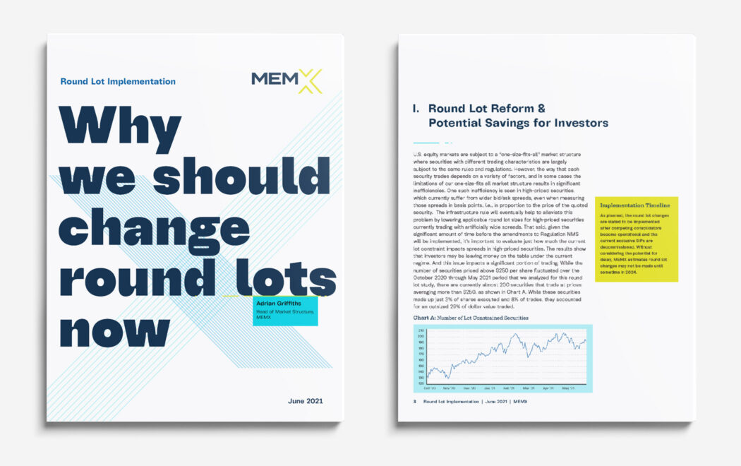
A brand identity is much more than a logotype and a color palette, but sometimes that’s all a start-up starts with. Such was the case with MEMX when, after 18 months of preparation, the new securities exchange was about to start trading. Taking MEMX’s three-page brand style guide and, working closely with its head of marketing, it became a robust visual system reflecting the organization’s mission and values—and signaling its legitimacy and prowess as a high-tech rival to NYSE and Nasdaq.

Created at Thinkso

Illuminated sign with the message "Help us build the exchange of the future today."
A bold approach to most elements of the new brand system aligned with their brand attributes, especially in the typography. Headlines, posters, and cover treatments crackle with kinetic energy and present MEMX with straightforward confidence.
A prototype of a new website focuses on a user-centric experience that has the modern technological feel that exemplifies the company ethos.
A hand holding a mobile phone with the image of an eblast and another hand typing on a keyboard
White papers, one sheets, eblasts, and presentation templates demonstrate the system’s modern design and flexibility. Providing ongoing support to MEMX for the past three years led to a deep familiarity with the subject matter and allowed for templates and one-off pieces that make the content shine.
image of a chair with the phrase "we've got an open seat"
Image of a shamrock with the word Sláinte!
MEMX’s social media space uses illustrations that employ a “digital line”, a unique graphic element that speaks to their technical expertise.
Pull up banner in the garden
The expanded identity system includes opportunities to really push the graphics in electric and edgy ways. For the first anniversary of trading, we wanted to celebrate some really big numbers.
Internal programs are a chance to bring colleagues together and highlight the secondary colors in branded events. These branded “exciting off-sites” use a different version of the X each time while maintaining the distinctive look on the subbrand.
Each holiday season was a chance to bring some animation into MEMX’s X in a new and increasingly imaginative way. For the 2022 holiday e-card, the X-motif became stars in the winter sky to reinforce a message of relationships and connection during the holidays.