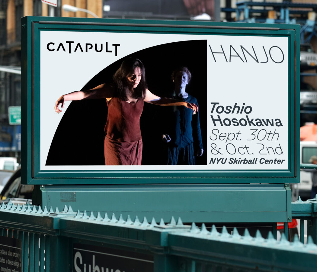
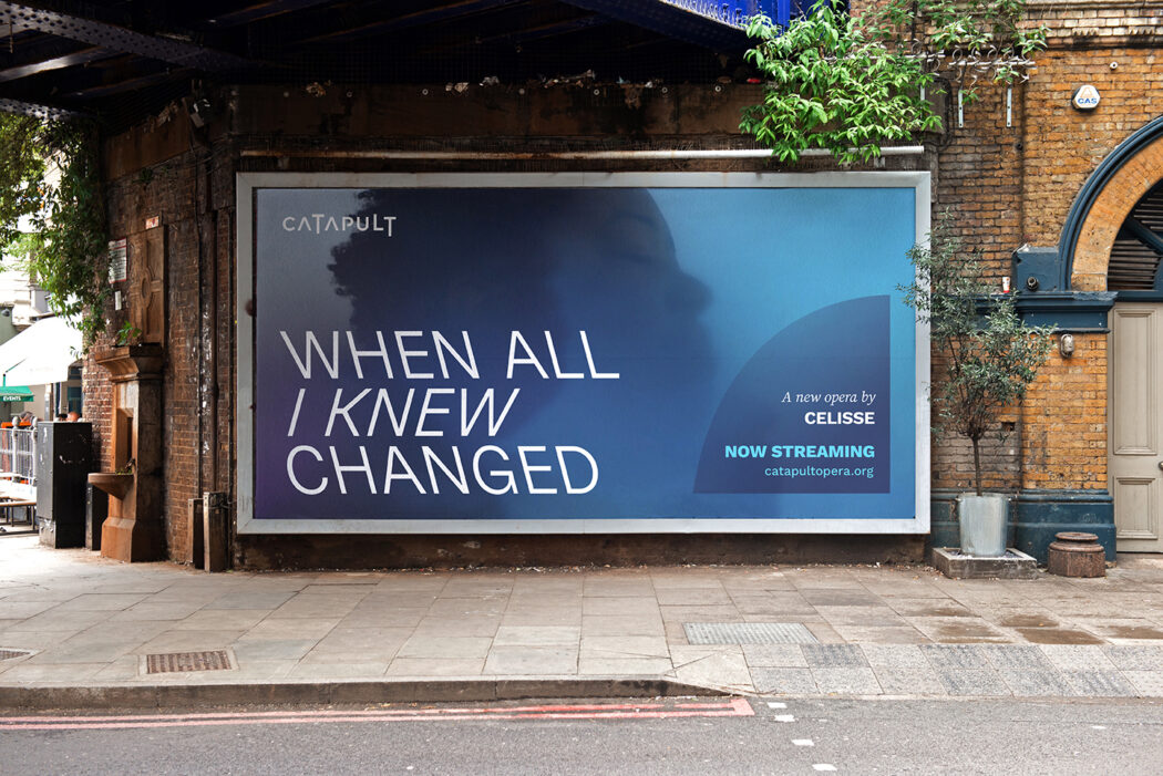
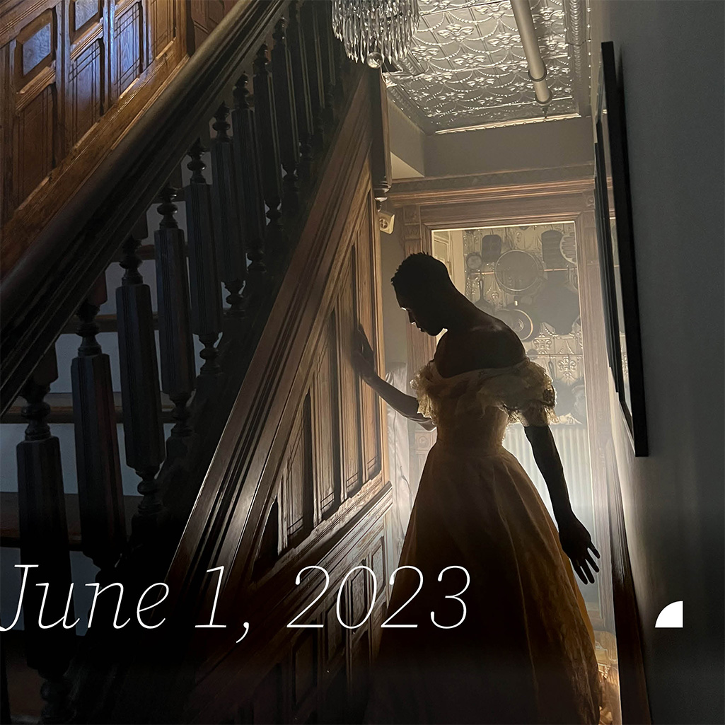
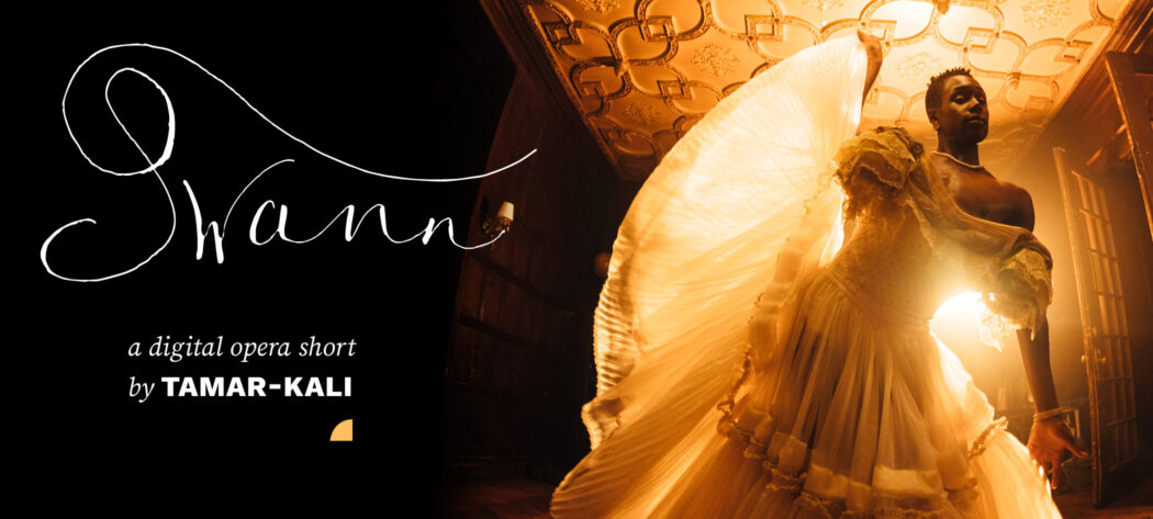
“New York’s number two opera company,” Catapult Opera cultivates a new generation of enthusiasts by producing original and under-appreciated works that push the limits of the genre. But their identity wasn’t keeping pace with their ambition. The challenge was to create a system flexible enough to honor each production’s unique character while binding everything together under a recognizable Catapult identity. We developed an arc motif—a graphic that can house production-specific photography, carry copy, or shrink to a branding bug, and that captures the sense of Catapult launching opera into its next generation. The result is a modern, flexible identity that helps redefine the art form and hits both the high and low notes.
Created at Thinkso