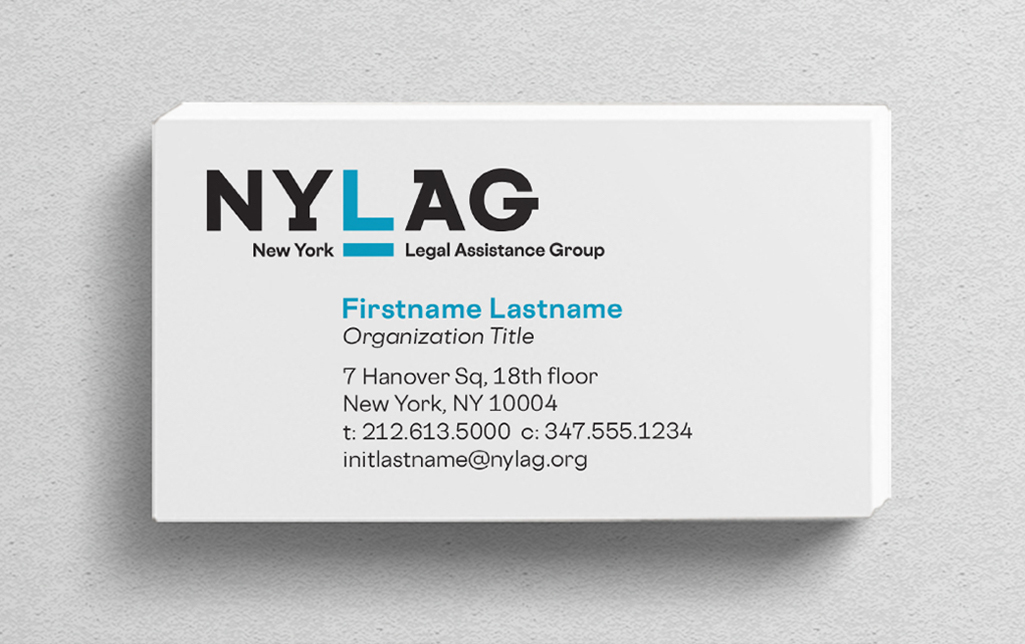
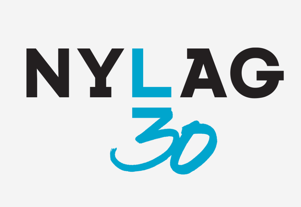
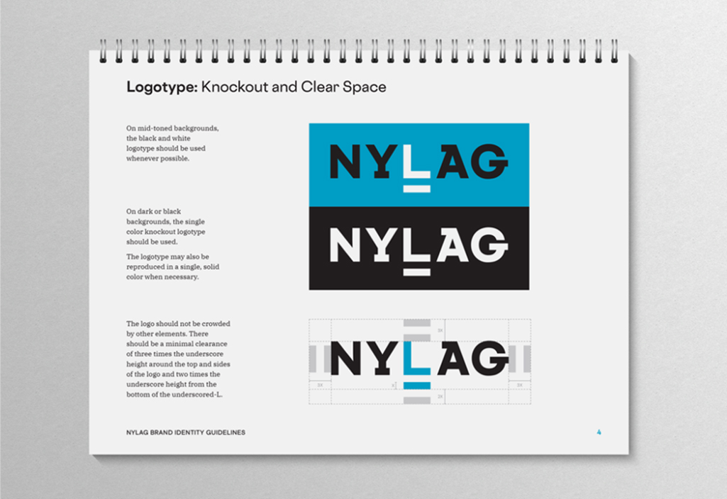
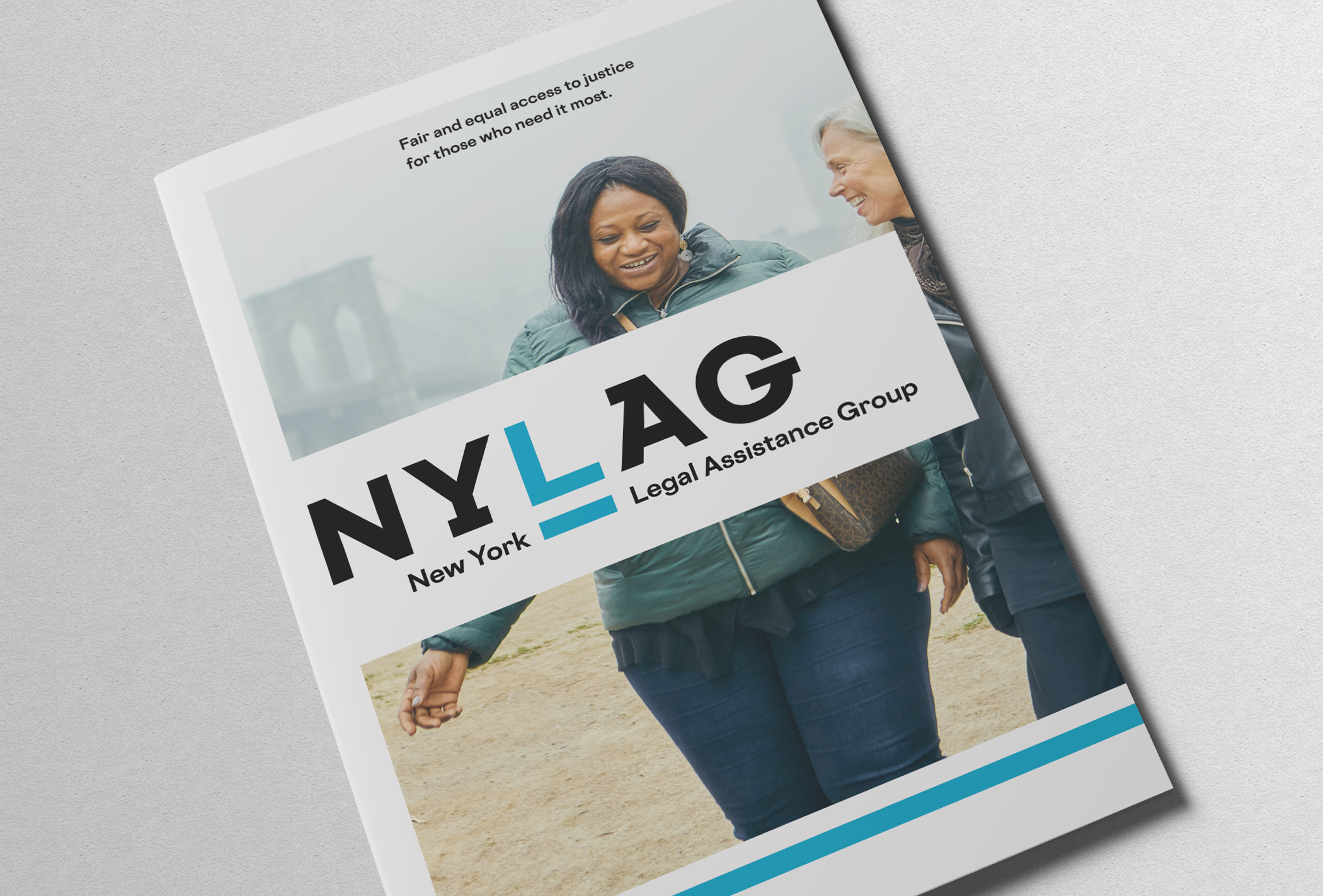
The New York Legal Assistance Group is one of the city’s premier organizations providing free, high-quality legal services to people and communities experiencing poverty but their identity didn’t reflect the impact of their work. To better strategically align with its core attributes, a modern identity was built on the foundation of their new logotype. The letterforms are infused with a progressive, horizontal energy, and the underscored L at its center stands for “equality under the law”—something all people are entitled to, no matter their resources. The rebrand included an overview brochure, corporate stationery, a 30th anniversary logo treatment, sub-branded programs, and brand guidelines.
Created at Thinkso