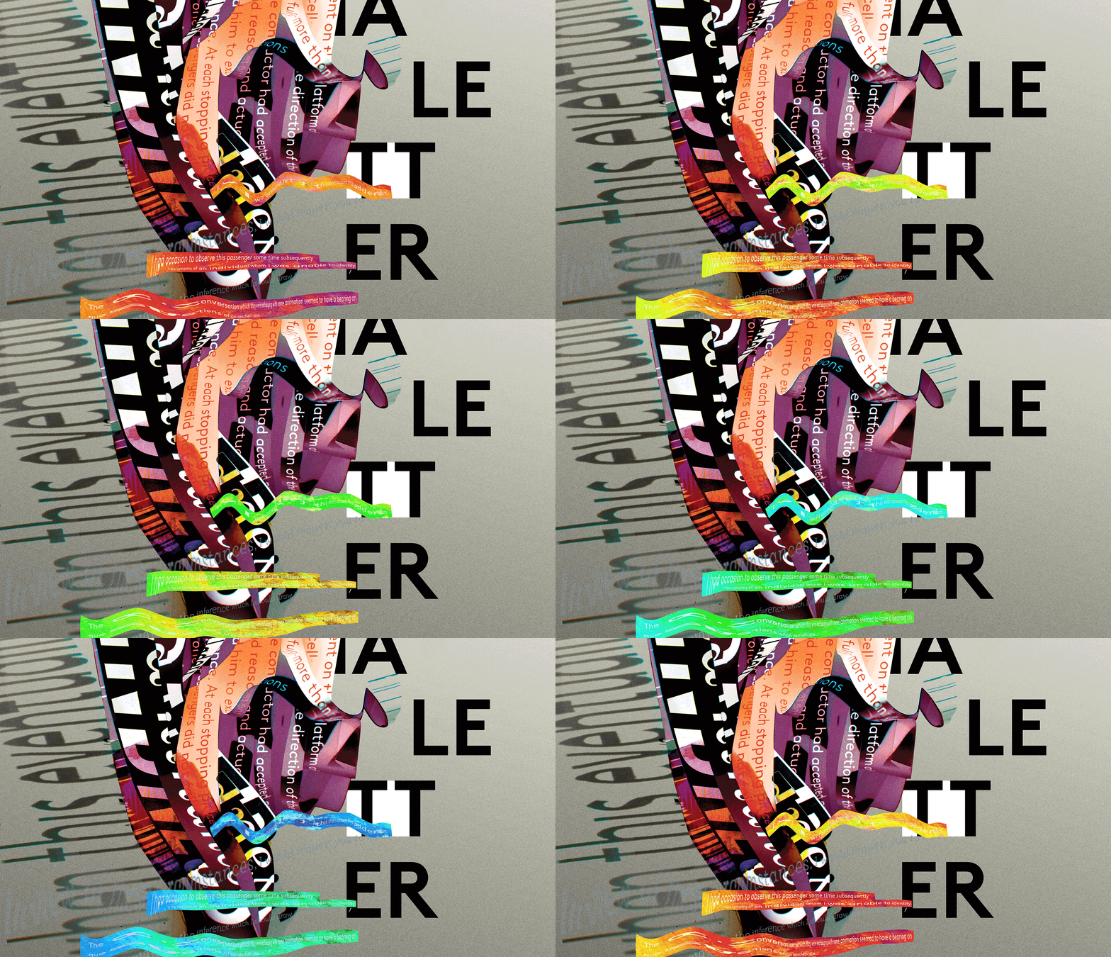
This is the first weight of a typeface family I’m designing.The counters have been carefully worked to create ink-traps and give the face a crackle at large sizes but still set beautifully at text sizes. I’m also creating bold and italic weights and the type specimen poster below references the face’s construction.


